Vanquish Media Group is a full-service digital marketing agency specializing in brand development, paid media, social media, website design, and SEO. While their expertise and client results were strong, their old brand identity and website failed to reflect it.
Outdated visuals, conservative branding, and generic photography left the agency blending in, rather than standing out as a leader in their space.
Scope of work
Brand Strategy
Logo Design
Brand Guidelines
Website Design
Social Media Design
Print Design
Challenge
Vanquish Media delivered strong results for clients, but their outdated brand and website didn’t reflect their expertise. The conservative visuals and generic presence made it harder to stand out in the fast-moving digital agency space.
Solution
We repositioned the agency with a modern and dynamic identity that better reflected their creativity and authority. The refreshed brand gave Vanquish Media the confidence to showcase their expertise and connect with ambitious clients.
Results
The transformation gave Vanquish Media a credible and competitive presence, strengthening their reputation and appeal in a crowded market. With a brand that now matches the quality of their services, they are positioned as a trusted partner in digital growth.
+90%
consistency in brand usage across all departments
+45%
boost in landing page conversions after rebrand
+52%
increase in social media engagement on branded content
+35%
higher CTR on paid campaigns using new visuals
360 approach to building brand identity
Our highly experienced brand and illustration team worked closely with the team at Vanquish Media to define, develop, and design a new logo.
The branding and promotion strategy of the agency has to take into account both digital and physical communication with the user. The visual consistency is reached with several key elements: logo, colors, illustrations, and typography.
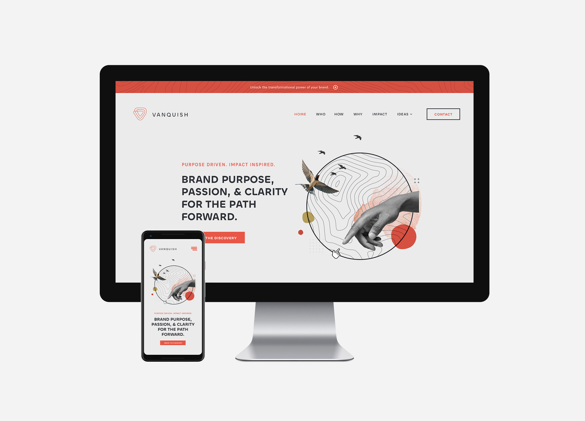
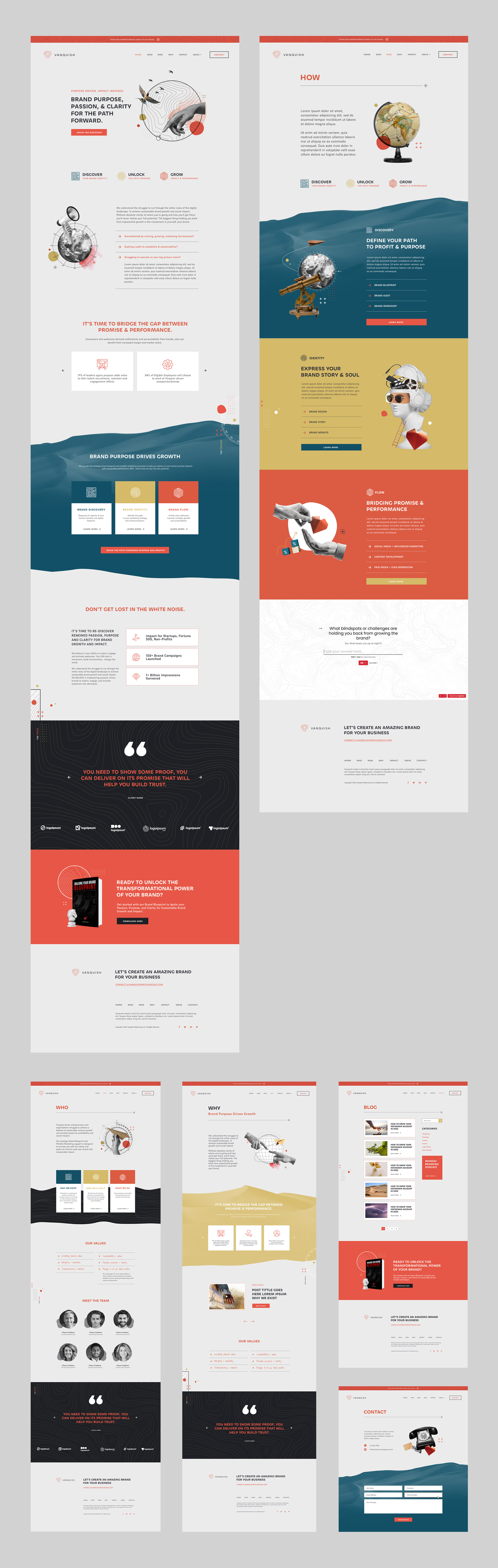
Modern agency website with custom illustrations
The user interface design of the website is based on simplicity. It’s full of air and uses a limited color palette that supports quick connection to the brand and helps visitors to avoid distraction and make the web pages scanned easily due to contrast colors and readable fonts.
The original illustrations support positive user experience with the power of storytelling and give the layout original and trendy looks. Prominent CTA elements are seen instantly to focus users’ attention on the core interactive zones.